On September 25, 2019, the 7th floor of the CoRE building became the venue for a Design Slam. Hosted by Josephine Giaimo of the New Jersey chapter of the User Experience Professionals Association (UXPA), participants enjoyed some pre-slam chit-chat, some light snacks, and then dove right in.
So, what is a ‘design slam’? At a design slam, the participants receive a ‘design request,’ which can be anything from reformatting a ‘sheet of paper’, that is a hard-copy form, or adjusting how content is displayed on a web page. Participants break into groups, with each group building their vision of the project in a way that is more visually appealing and functional than the original. In this design challenge, we broke into two teams with four members each: the North team and the South team.
We all came from very different backgrounds which made our groups interesting to work with. Some of us are participating in the Rutgers MBS Program with various focus areas such as Personal Care Science and User Experience (UX) Design. Others are just interested in UX Design and learning more about UX overall. Bringing together our different educational and work experiences made for some very interesting design perspectives.
Our design request was to put together a visually appealing set of instructions for doctors to give to patients prior to a colonoscopy. Yes, you read that correctly: colonoscopy instructions.
To be more specific, these are the instructions given by a doctor’s office to a patient to prepare for a colonoscopy. Patients need to take specific steps to prepare for their colonoscopies a full 24 hours in advance of their procedures. First, there are several items that patients must purchase for their preparation. In addition, they must drink specific amounts of fluids, not eat solid foods, and take specific medications at very specific times. If the instructions are not followed perfectly, the patient may not be able to have the colonoscopy as scheduled.
With these instructions, the two teams dove into our design slam challenge. Each team took a very different approach to this project. In fact, the combination of both of our solutions would be quite effective to give to the doctor's office\ to improve their communication with patients.
The South Team focused on rebuilding the paper form that they were given. They decided the form could be more ‘generated’ directly from the doctor office’s system database, thus reducing staff workload and increasing accuracy of collected data. The redesigned form was concise and complete. Information was divided into “accepted” and “not accepted” items – such as foods to eat or not eat – which made the ‘purchase listing’ easier to read. The South Team also assessed how the instructions were given and decided to streamline and simplify language in order to make the instructions clearer. The team envisioned that many patients using this form may not have access to a computer or smartphone, and that the form would be handed to patients as a hard copy during the office visit.
My team, the North Team, focused on displaying the information on a website or smartphone. We assumed that the patient already had a working login to the doctor’s or health system’s web portal and could directly access the page that explained the process of prep-work, items to purchase, and steps to follow. The website portion would have a main landing page, then subset pages for each ‘step’ to follow. Each step would be designated a ‘color’, where there would be a ‘color button’ to press on the top of the site. The purchase list would be adjusted to include all the items needed (including clear liquids, broth, etc.). The steps for the day before would start with a detailed timeline. The timeline generated would also be specific to that patient. The timeline would include what was needed to drink prior to taking any of the medications. Then the website would break out the ‘accepted’ and ‘not accepted’ items which could be had during the day. For the day of the procedure, the website would specify exactly what needed to be done and separate out any insurance information and /or cancellation details.
Most importantly, the North Team decided to add video instructions for each step of the process and use encouraging words to guide the patient through each of the steps. Additionally, each ‘step’ must be completed before moving forward—from purchasing the right items, to exactly what to do 24 hours before the procedure. We also wanted to rebuild the printed form but ran out of time...so it was good that the South Team already completed that task!
After both teams presented their work, Josephine declared a tie for first place, since the combination of both of our solutions was the ideal situation to provide to the doctor’s office.
Overall, everyone had a great time working together and we look forward to the next UX Design Slam where we can continue to challenge ourselves and each other. Thanks again to Josephine for hosting such a great event. Until next time!
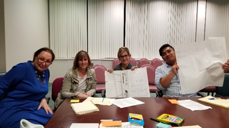
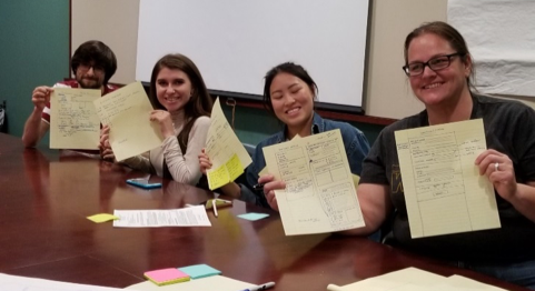
The North (above) and South (below) teams presenting their designs.